

About This File
As always, many thanks for the awesome emulator to the great, late Wizard.
Secondly, thanks to @infection for the images.
Thirdly, thanks to @hitthesix for the help with removing the refill pnd coin message when the machine starts up ![]()
--------
Okay, on with the main changes from release version 1.....
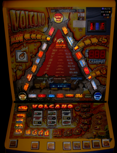
Updated graphics.
1) I have edited the top of the machine so that it doesn't show the flash glare like it did before (there is still a little red light reflection on the main VOLCANO lights at the top but I thought it added to the effect and if I removed it, it may make it look wrong).
2) I changed the lighting for the inner volcano gameplay so the red and yellow lights show okay and don't have any gap in the middle like they did before, as I have learned so much since the original release (the only slight issue is that it only shows the left side light when playing the inner feature but as it's mostly shaded anyway, you can't really tell. I realised this afterwards but think it looks better than the previous version with the gap).
3) Since I started doing it, I downloaded a manual for the machine and saw that the values and the fruit etc. on the bottom left were separate so I created the separate bulbs for each of them.
4) I noticed that the light for the BWB logo on the top section wasn't enabled at all so I added that one.
I did think about using a bulb light but didn't think that the overall effect would look right. I hope you think it looks good and better than before ![]()
The other thing I did was remove the side art as I felt while it looked nice, it detracted from the machine.
Enjoy, take care and stay safe!!! ![]()
What's New in Version 2.0.1 (c) See changelog
Released
I have been looking at the graphics and kept wondering about the images for the cash amounts on the bottom section and thought it didn't look quite right, so I watched another video on YouTube of the machine and noticed that the whole image was lit.
As it was the second release I'd ever done, I don't think I realised at the time differences between the lighting and the fact the darker image could be used as the off-image and helps with the different brightness of the lights.
However, with the help of numerous people on here, including the late, great Wizard, here's the updated version with the better looking lighting for the cash amounts on the bottom section.
Anything else you may notice, please let me know ![]()


Recommended Comments