Jump to content

Corn of the Dead DX 1.2.1

   (5 reviews)

2 Screenshots

About This File

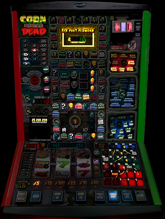
I am especially pleased with this as I did a lot of editing from a picture that had a long lighting stripe on and other parts where the light covered the images.

I made it darker as the original was a bit too light and didn't show the lighting up very well.

I saw a video on YouTube where it had a note inserter that had pulsating coloured LED lights on and looked nice but it currently isn't emulated and I think it might be too distracting.

I haven't done any fancy stuff on it like I did the others as I didn't think it needed any as it has Neon lighting at the top, red changing reels and plenty of other lights to keep the eyes athetically pleased looking at it.

As always thanks to Wizard for the awesome MFME emulator and Slasher for the excellent DX version initially.

I hope you enjoy it as much as I enjoyed learning about the updates to the graphics etc. :D


What's New in Version 1.2.1   See changelog

Released

After having people reporting they're having issues opening the file using WinRar or it showing as being corrupt, I've just redone the zip file using the Windows SendTo option to see if that makes any difference........ PLEASE let me know if it works better and I'll use that from now on......


1.2.1 - Tiny little update not worth updating the version number, the lighting for the Transfer £5 was everso slightly out of alignment. **
            Another tiny update, the offimage for Change Stake button to the darker version **
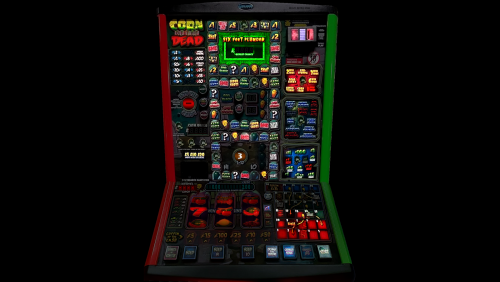
            Added graphic for note acceptor (doesn't actually do anything but I thought it needed it as it has the lights for it!!
            Minor updates to the reel graphics etc and the bottom of the machine, removing the little white lines

1.2.0 - Updated the reels to blue with lines down and added some dice to it as well.
            Adjusted reel 2 angle so it looks more in line with the others
            Added Red Hi and Red Lo
            Added extra light to the logo at the top left but not sure if it will work and whether it will be correct or not. Time will tell :D

Thank you for pointing the Red Hi and Red Lo out and the reel colours and dice too.

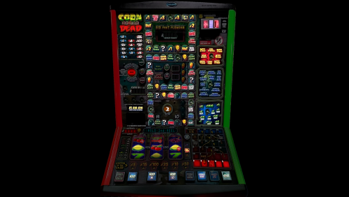
1.1.0 - I didn't understand really how the RGB worked but Wizard kindly sent me photos and explained how it worked and guess what.... It now has real colours on it (Six Feet Plunder part at the top).

I seem to remember the logo stays the same colours with yellow and red because I tried it with all the colours the same and it just didn't look right so I have updated it accordingly and am really pleased with the results.

Many thanks to Wizard for his help :D

Enjoy :)

Completed RGB.png

  • Like 9
  • Thanks 5
  • Awesome 5
 Share


User Feedback


Wildmanslots

   4 of 4 members found this review helpful 4 / 4 members

A perfect follow on from Slashers initial release.

Always an enjoyable game and getting the LED strip on the plunder panel works a treat

Now who fancies messing around to recreate the Powerplay RGB effect panel hahah!!!


Top man. I am VERY tempted in joining in as a DX'er - im pretty OK with photoshop haha, well the last 3 betcom releases were designed in it... 😜😜😜😜

Response from the author:

Believe it or not, this is my 5th layout. The first was Volcano that took me a long time to learn how things worked and when I got used to them, they've updated MFME to include animated buttons!!! That's something that I'd like to have a go at but at the moment, I'm learning how to edit and try and find the best ways to create DX's.

As my laptop was randomly rebooting when I was doing the previous releases, I had to keep coming out of them after a few edits and copying the files to another folder.

One thing I found helpful was that if I was working on a section of graphics, when I finished with them, I'd move them to the backup folder so that when I'm working with the new graphics, I'm not having to scroll through a lot of files (as there are a lot of them on this one!!!).

Go for it. Nobody will judge you if you're not good at graphics. I've always wanted to do things artwise and use GIMP as I am careful with money.... some may say tight, but having a few kids, I have to be!! :)

I've found that the people who joined this group are really helpful and friendly and I, for one, wouldn't like to think of anyone being horrible or nasty to anyone if the graphics are what they would consider under par or not as good as someone elses. We all learn and I have had ideas how I want things to look and have played around with settings in GIMP until I got the results I wanted.

I'm moreso pleased with this one, not only because I was determined I was going to fix the graphics that had big lines of lights on it and make it look the best that I can, but that others have appreciated my efforts and given me 5 stars in the reviews (which gives me a bit of a buzz :) )

  • Like 2
Link to review
slasher

   4 of 4 members found this review helpful 4 / 4 members

Looks mint absolutely bang on. Happy days, well done!


Thank you!

Response from the author:

Thank you for your fantastic review.

I was really hoping that people would love it and I amazed myself how good I managed to get it to turn out, given the original graphics. :D

WIP - Nearly finished and original.png

  • Like 1
Link to review
Zippy

   3 of 4 members found this review helpful 3 / 4 members

Dogs bollocks is all I have to say.

Response from the author:

That is praise of the highest order!!! :D

I've updated it with more graphics changes, some subtle and one less subtle :)

  • Like 2
Link to review
infection


Good layout  and very good machine  looked a very tough machine to emulate thanks to you and @slasher for creating this Amazing G⬜

Response from the author:

Thank you.... only 4 stars?

Can I ask what I could do to make it a 5 star one for you? :)

  • Like 2
Link to review
×
×
  • Create New...